Executive summary
Define the grammar before you write the sentences
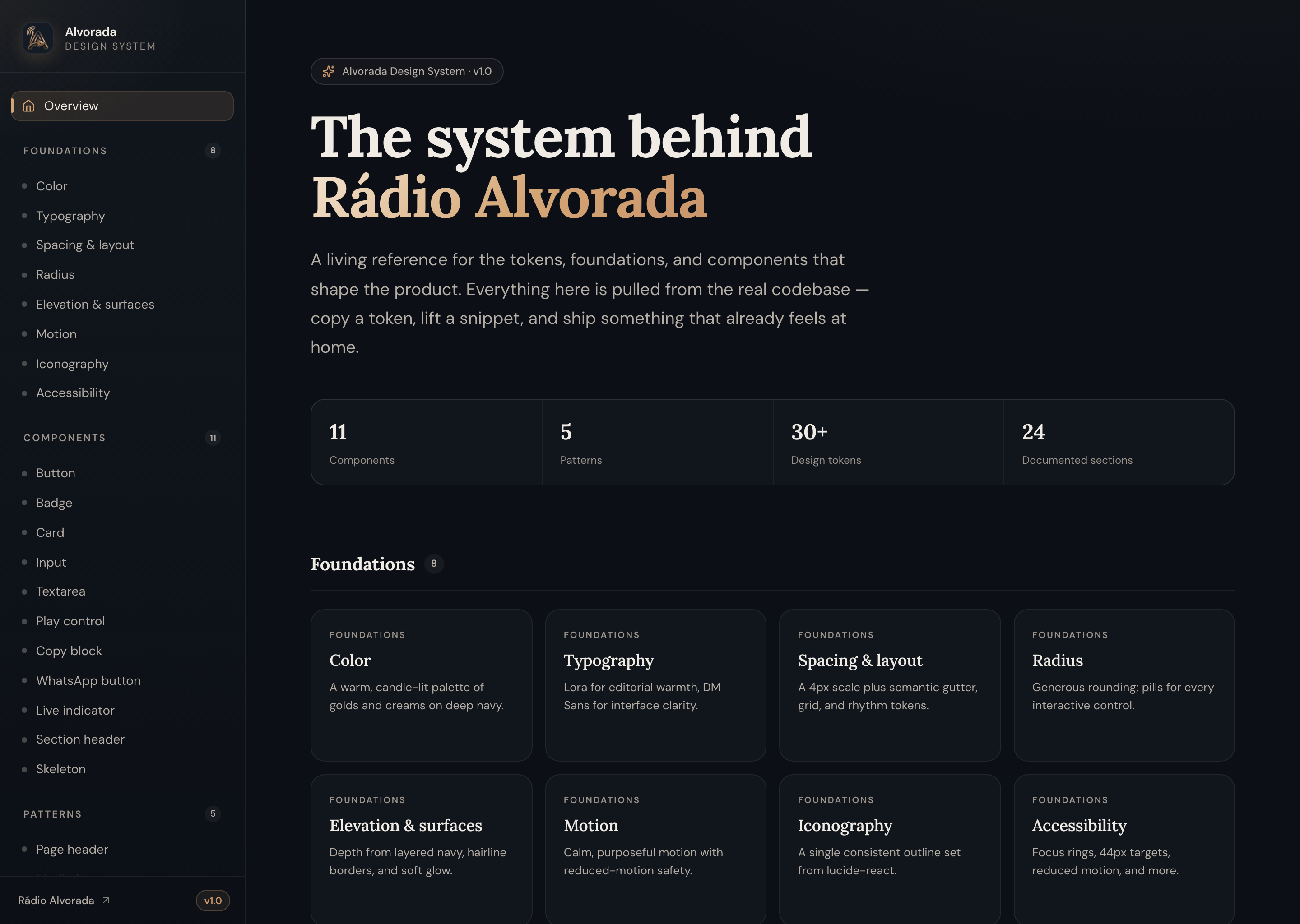
Rádio Alvorada is not one site. It is a public platform, a browser-based audio studio, and a custom live TV viewer: three surfaces serving one gospel media brand. They share one identity because they were designed to inherit from the same foundation.
I built that foundation first. Tokens, typography, spacing, motion, and the core components were established and documented before the website shipped, then extended as audio tooling and live TV followed. The public reference at /design-system is where those decisions live: argued on the page, copyable, and ready for the next surface.
Design principles
Warm, reverent, and calm under pressure
The brief I set for the system was simple: one warm, reverent identity that stays calm whether someone is listening to music, watching a live broadcast, or reading an article. That meant constraining the palette, limiting accent colors to semantic roles, and keeping interface density low enough that the content always leads.
Semantic over decorative
Every color token maps to a role: primary action, surface elevation, live state, muted metadata. Decorative color is not a category. If a hue does not earn a semantic name, it does not ship.
Two voices, one scale
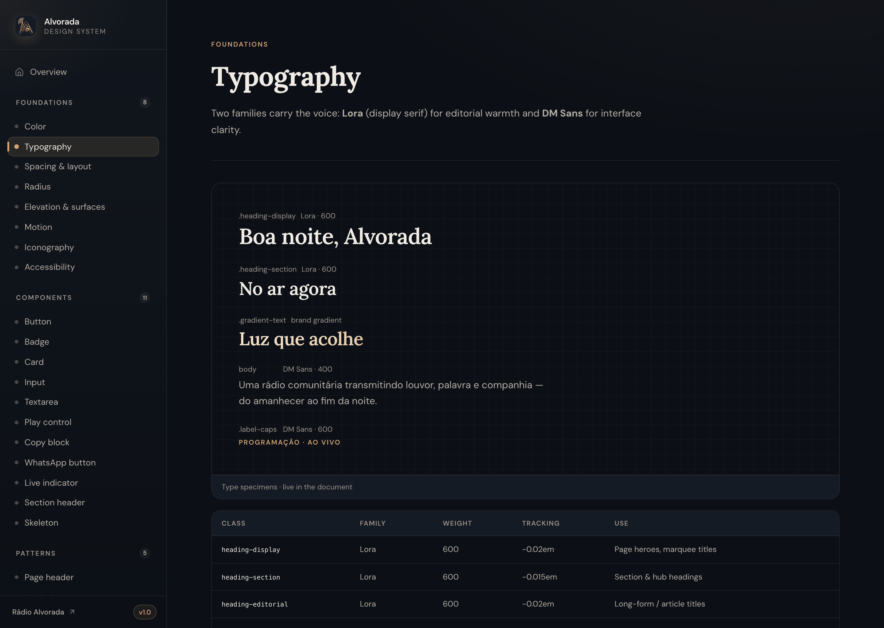
Lora carries editorial warmth in headings; DM Sans keeps controls and metadata quietly legible. One type scale governs both, so rhythm stays consistent from a hero to a form label.
Depth by tone, not shadow
Surfaces step forward through layered navy and hairline borders rather than drop shadows. Elevation is felt as tone, which keeps the dark UI calm and avoids visual noise on small screens.
Opinionated, not exhaustive
Eleven components and five patterns, not fifty widgets. Each entry earns its place by appearing on more than one surface. The system scales by composition, not by accumulation.
Token architecture
Warm gold on deep navy, with coral reserved for live
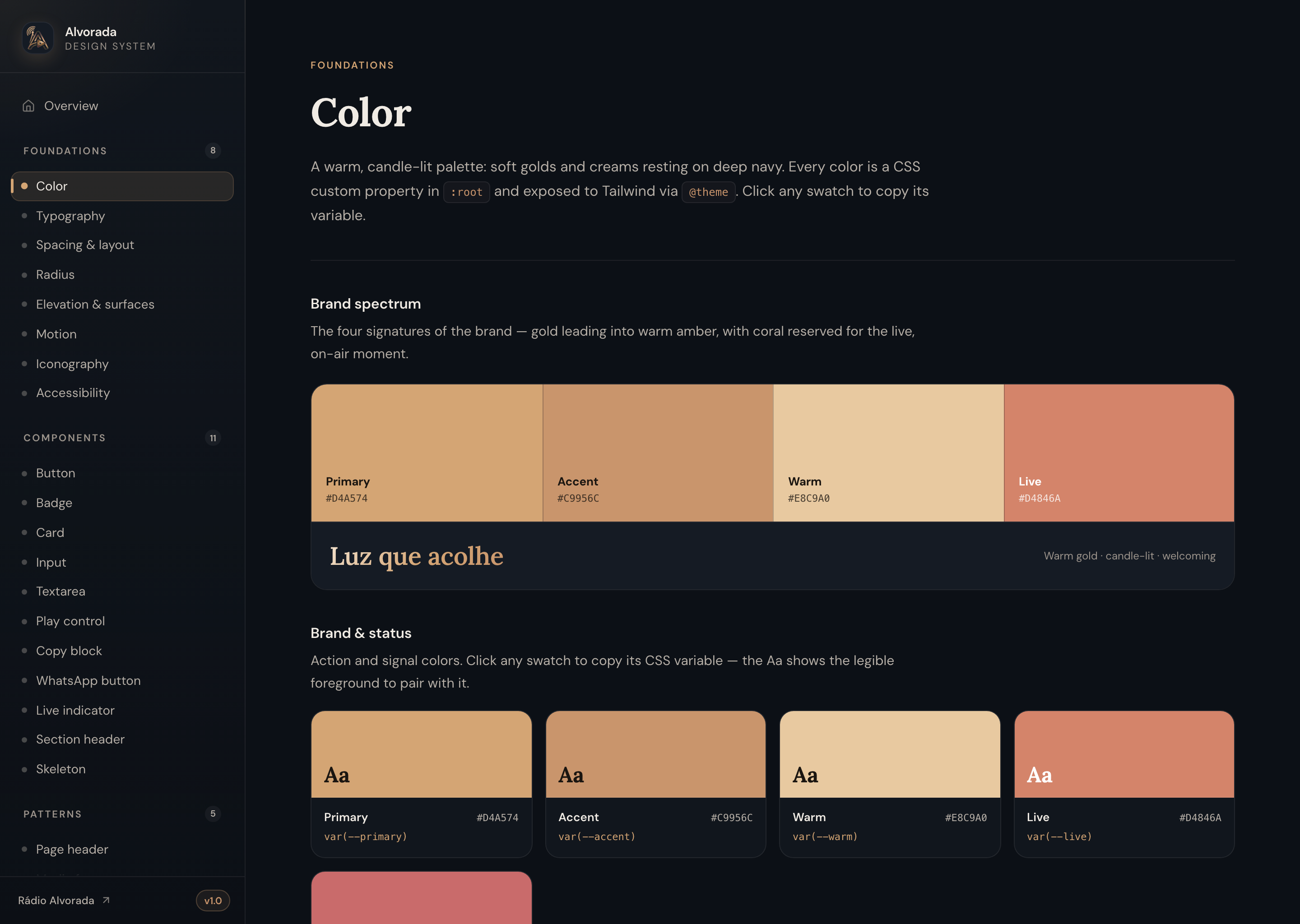
The palette is candle-lit: a primary gold leading into warm amber and cream, all resting on a layered navy. Coral is reserved for one job only, the live, on-air moment, so “we are broadcasting” never competes with ordinary actions for attention.
Tokens are semantic, not literal. --primary, --card, --foreground: names that describe intent, not hex values. That keeps the whole identity re-themeable from a single place and makes contrast pairings a contract, not a guess.
The color section
Documentation that proves its own decisions
Most design systems treat color as a wall of squares. I treated it as the section a team opens most and judges the system by: so it earned bespoke layouts instead of a generic swatch grid. Every decision is visible, testable, and copyable on the page.
A brand spectrum, not a legend
Primary, accent, warm, and live open as a full-bleed band with on-color labels, capped by the brand line in gradient: so the palette is felt before it is parsed.
Swatches that prove legibility
Each chip carries an Aa in the exact foreground you should pair with it. The preview is the spec: if it does not read on the swatch, the pairing does not ship.
Surfaces as a ramp, contrast as a contract
An interactive navy ramp shows depth as elevation, and a contrast section renders the pairings the product actually ships: each with a live sample and a WCAG AA / AAA badge.
Component taxonomy
Variants with rules, states with meaning
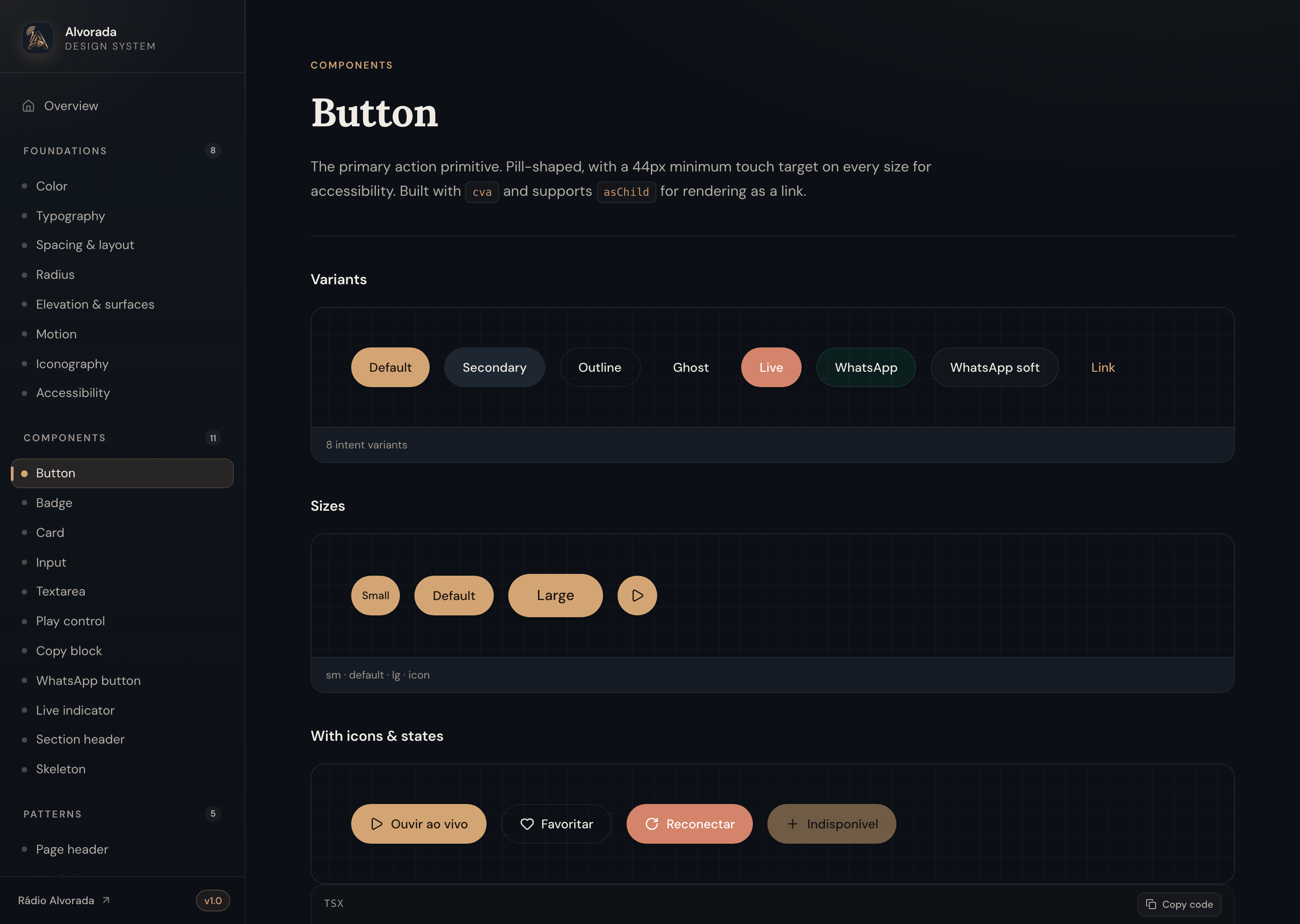
Eleven components are documented the same disciplined way: a live preview, usage guidance, a variant table, and accessibility notes. Buttons, cards, inputs, play controls, live indicators, media frames, and step lists: each with a clear answer to “when do I reach for this?”
Variant strategy follows intent, not decoration. Primary actions use gold; destructive actions are rare and visually distinct; ghost and outline variants exist for secondary contexts. Loading, disabled, and active states are documented alongside the default so no surface invents its own spinner or opacity trick.
Live specimens
Every demo renders the production component in every documented state. What you see in the reference is what ships on the surface.
Patterns above parts
Five patterns document composition: page headers, media frames, status rows, step lists, and reveal-on-scroll entrances.
Spacing that breathes
A constrained spacing scale keeps rhythm consistent from a card gutter to a section break. No arbitrary margins on any surface.
Accessibility
Built into the foundations, not bolted on later
Accessibility is documented as a foundation layer, alongside color and type, not as a footnote on individual components. Focus rings, minimum 44px touch targets, reduced-motion behavior, skip links, and live regions are specified once and inherited everywhere.
The contrast section closes the loop: every text-on-surface pairing the product ships is rated on the page. If a new surface needs a pairing not yet documented, that is a system change, not a local override.
Responsive design
One mental model from desktop sidebar to mobile drawer
The documentation navigation was designed as a spatial map, not a hamburger menu of links. On desktop, a fixed sidebar holds the full system tree and never drifts with the page. On mobile, the same tree collapses into a calm, non-scrolling drawer that shows foundations, components, and patterns grouped and counted at a glance.
Breaking the system into one page per section keeps each topic shareable by URL and short enough to absorb. The overview is a card index; every section is a destination. That information architecture scales as the library grows.
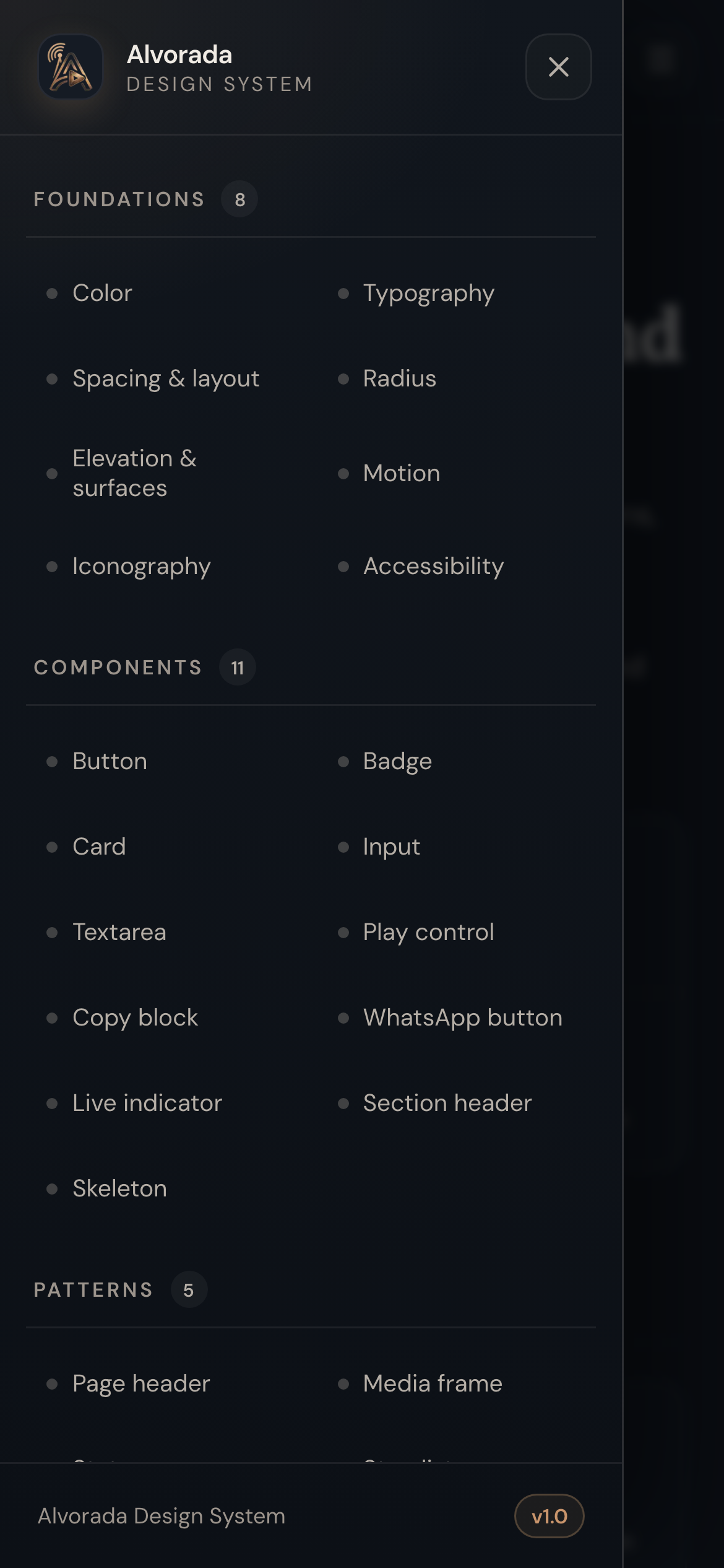
On mobile, the navigation is a single non-scrolling drawer: the whole system at a glance, grouped and counted.
The drawer mirrors the desktop sidebar so the mental model is identical across breakpoints.
Scaling the system
One identity, inherited by every new surface
The website, audio tooling, and live TV viewer each started from the same tokens and components documented here. When a new surface needs a UI element, the first question is whether an existing component or pattern already covers it. Only when the answer is no does the library grow.
That governance keeps the system small, opinionated, and defensible. The result is a living reference a team can lift from and a designer can argue from: documented so the next surface starts from certainty, not guesswork.
- 24 sections documenting the foundational layer of the platform
- Semantic color tokens with WCAG-rated contrast pairings on the page
- Eleven components with variant rules, states, and usage guidance
- Five patterns for composition across website, audio, and live TV
- Accessibility, spacing, and motion specified as foundations, not footnotes
- Responsive documentation IA: fixed sidebar on desktop, non-scrolling drawer on mobile